
DISCLAIMER:
This was my first project before I had any official training.
I submitted this design for a name/logo design contest for a local orthodontist. They wanted a logo that was inviting and represented the broad cliental they serve, not just pediatric work which their previous name stated.
Below are the first two logo concepts I submitted. I had seen logos similar to this style and wanted to create one of my own. However, these were not based on any key attributes or input from the company, just me being excited about making a logo.


After submitting the first two logos I realized I had missed the mark and had not considered what they were looking for.
The problem: The company's original name was Vineyard Pediatric Dentistry and Orthodontics, which brought in many customers for ortho and dental work for their children. But they also provide service for adults. They wanted a name that was inviting for everyone and was not limiting. One of the names they considered was Utah Valley Orthodontics, which covers a much wider customer base.
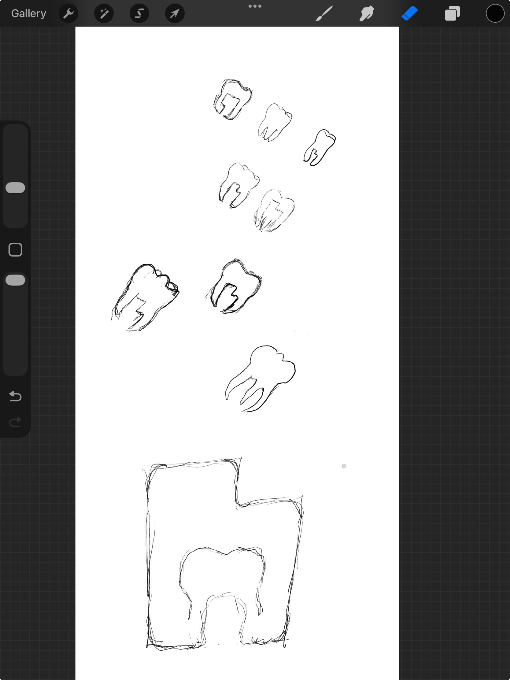
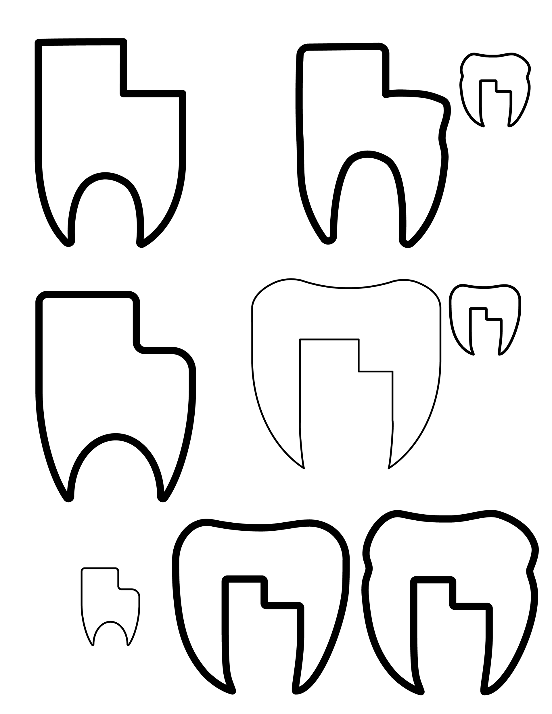
The solution: The Utah Tooth. There are so many dental practices that use a tooth in their logo, for obvious reasons, so I wanted to do something a little different. I was able to incorporate the shape of Utah between the roots of a tooth, creating a unique symbol. The tooth represents both dental and orthodontic expertise and the Utah shape in the negative space shows they serve multiple Utah communities.




I surrounded the Utah Tooth with the company name and year it was established to unify the design into one complete logo. I then tried several subtle type and color combinations.
I decided to use the sans serif typeface Verdana in all caps to give a clean, modern feel with a lot of breathable space.
Hues of blue are used to evoke feelings of cleanliness and trust which reinforce the professional and reliable service the practice provides, while also being bold, but not overbearing.
Putting the whole design into a circular badge was done to show inclusivity and legitimacy.