Background: Student Work
I was tasked to research and rebrand an identity based museum. The museum I chose is the National Museum of Mexican Art in Chicago, Illinois. I chose this museum because they have a lot of strong qualities and the artwork is amazing. My goal in this design was to be mindful of avoiding stereotypes and create a logo that is respectful and inviting.
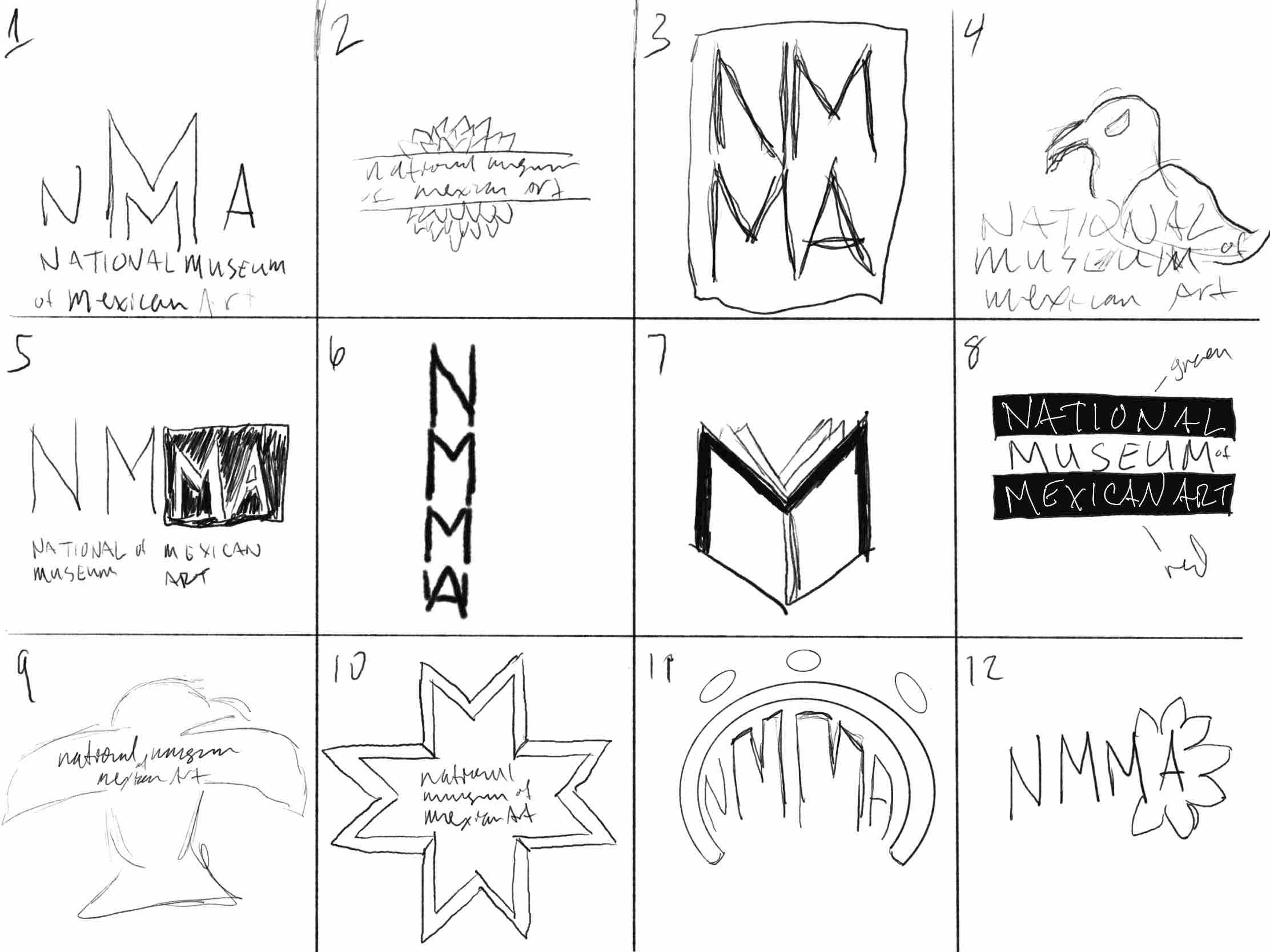
Key Attributes & Initial Sketches:
BOLD: NMMA takes a firm stance against racism and celebrates Mexican culture from both sides of the border.
WELCOMING: NMMA welcomes all people to engage with their art and to learn about the artists, techniques, and values of Mexican culture.
EDUCATIONAL: NMMA is dedicated to providing educational opportunities for Mexican artists and for members of the community by providing resources, curriculum, workshops, and professional development.
CELEBRATORY: NMMA is proud to share the richness of Mexican culture through their vast array of exhibits that include both performing and visual arts.
AUTHENTIC: NMMA is dedicated to providing opportunities for Mexican artists from both sides of the border to showcase their art and culture with their community and the world.
Top Three Logo Designs - Large & Small Scale
Design Thoughts
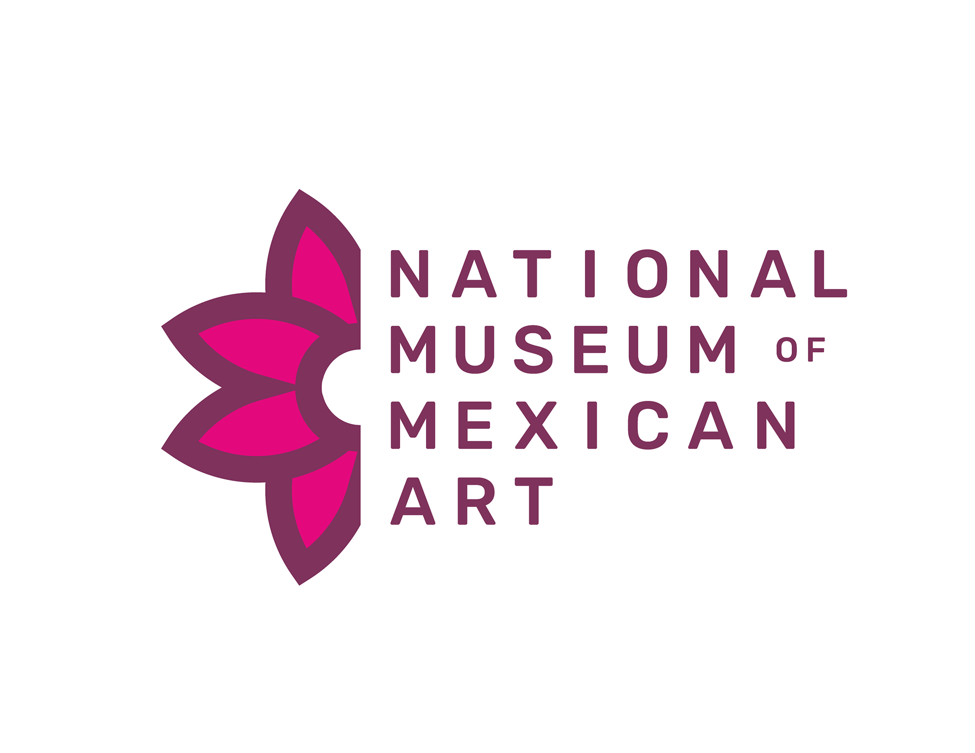
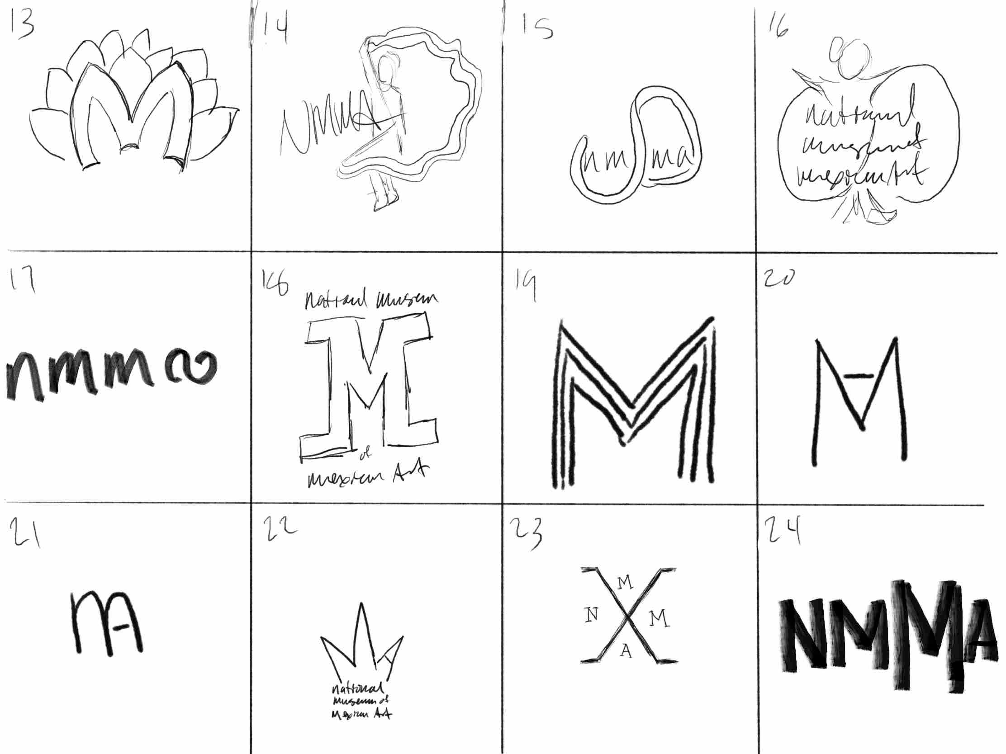
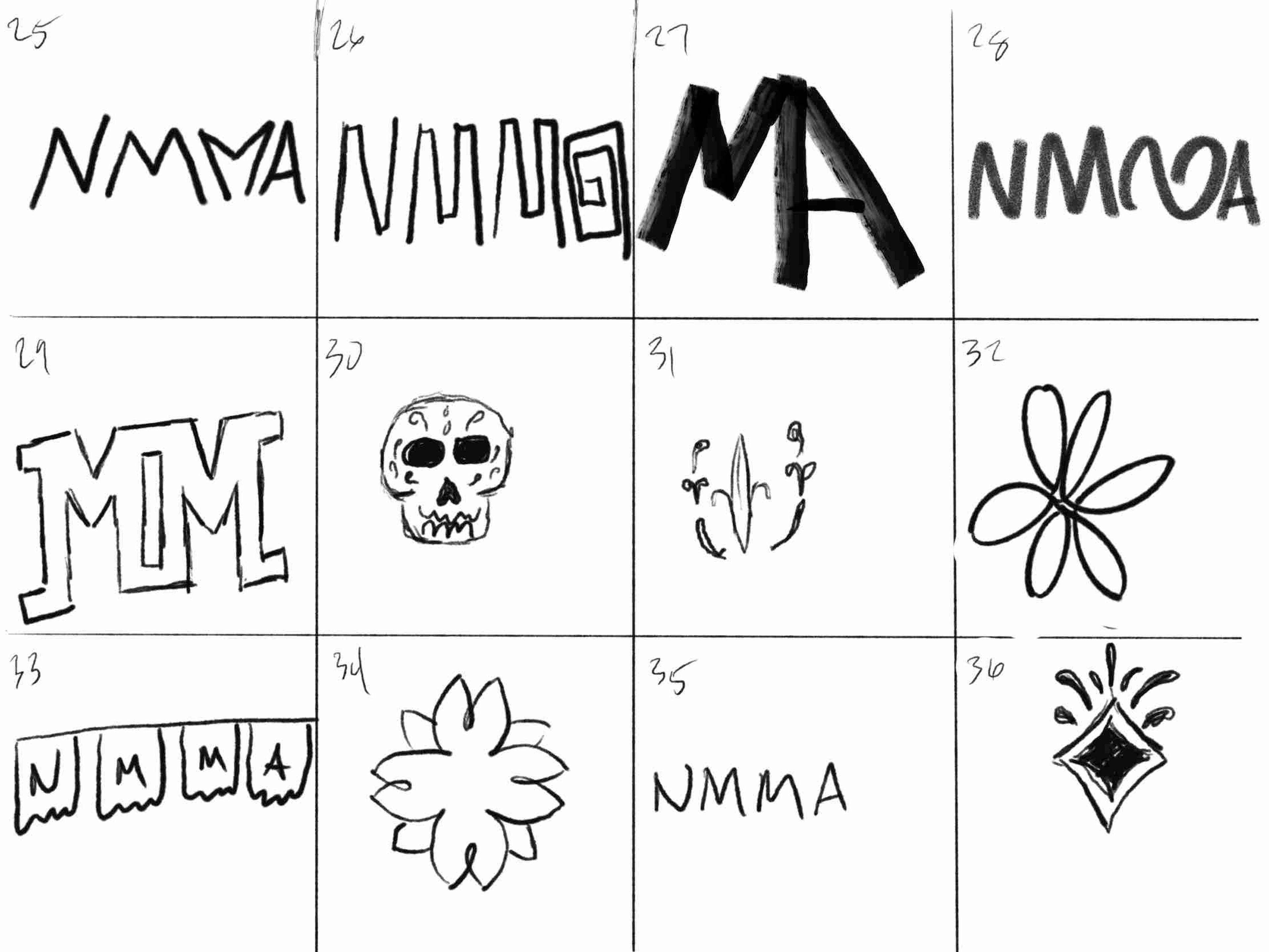
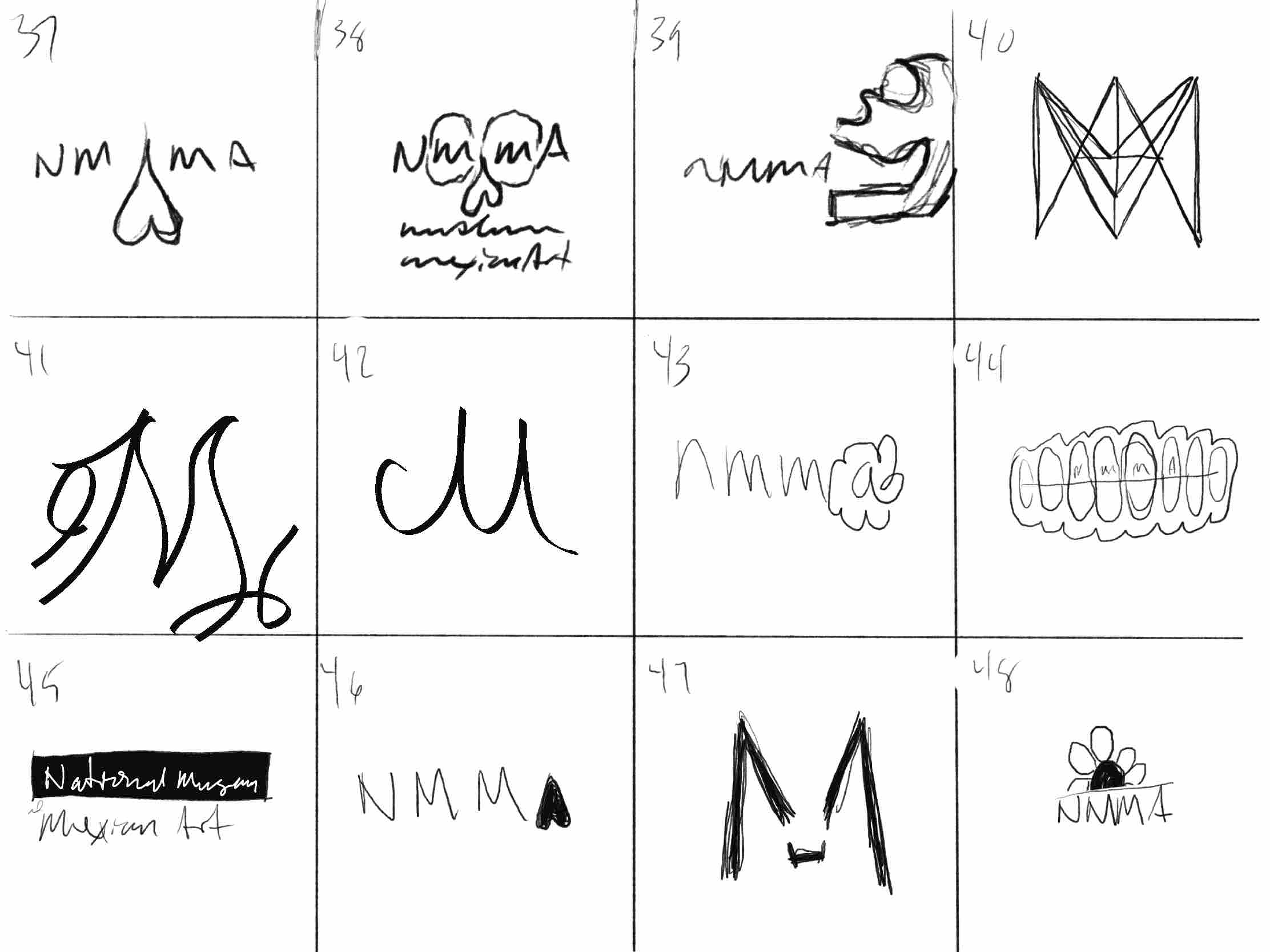
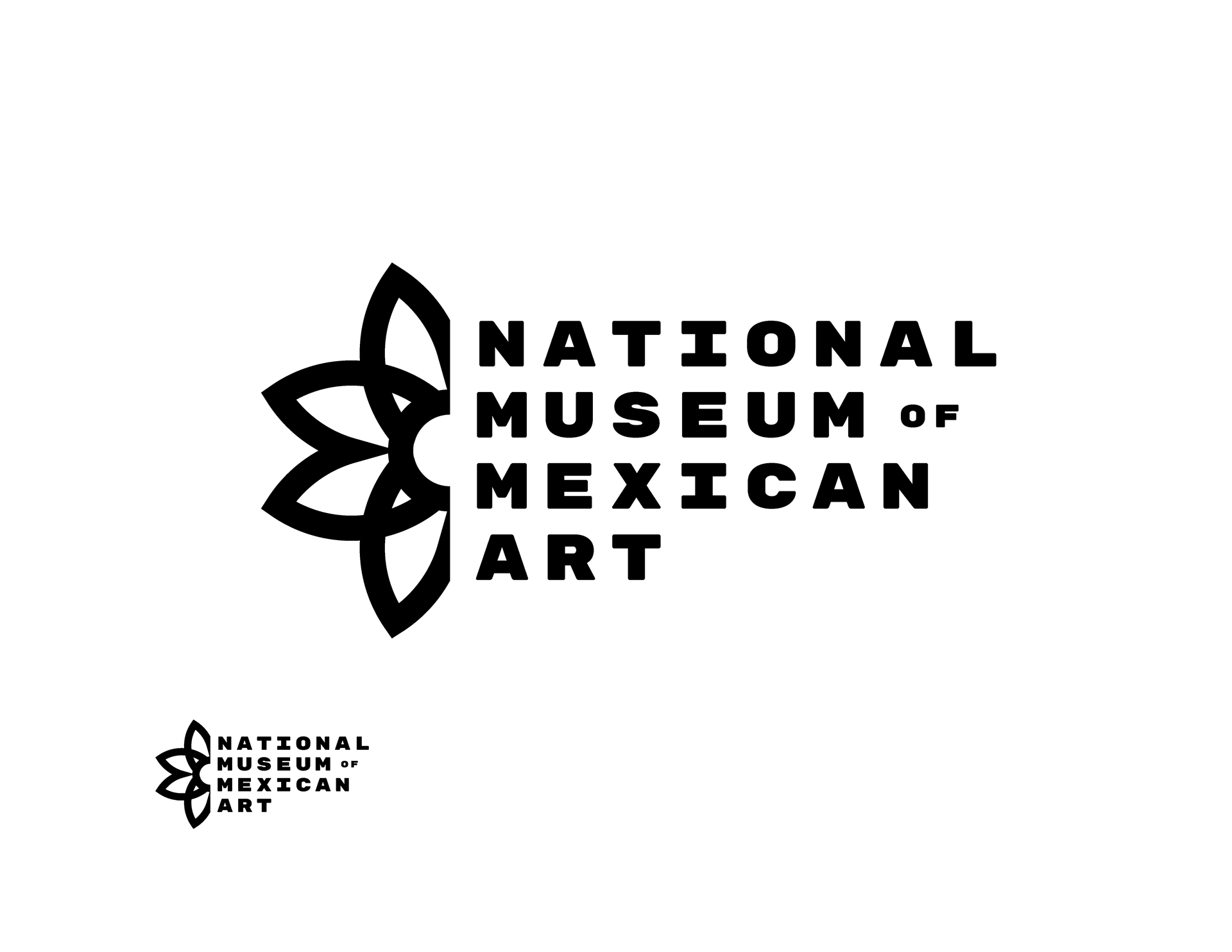
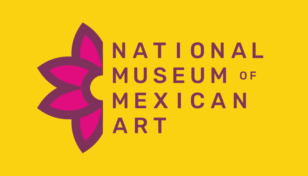
This design is a combination of sketch 13 and 34 which incorporates a stylized letter M with a simplified drawing of the national flower of Mexico, the Dahlia. I chose the Dahlia for the logo to showcase the authentic and celebratory nature of the museum's purpose.
Cutting the design in half allows for the Dahlia to sit right next to the museum name. I used a bold, monospaced, sans-serif typeface which allows the abbreviation of the museum, NMMA, to be easily seen vertically next to the Dahlia.
Design Thoughts
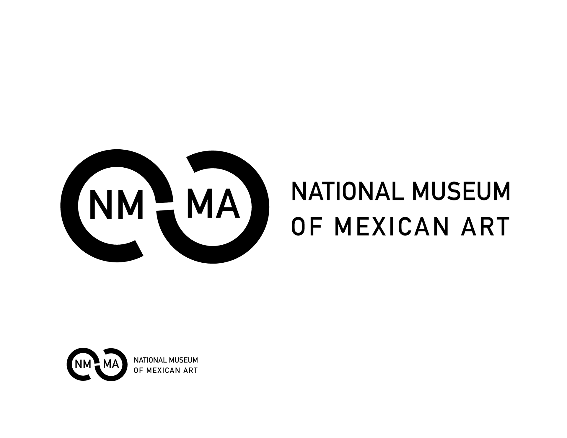
This design took inspiration from the movement of the Jalisco Ribbon Dress that is worn in the Folklórico dance. The circular shape encapsulates the abbreviation of the museum in two parts as a nod to the museums mission of celebrating Mexican culture from both sides of the border.
This design could be used with the museum name to the right, or with the brand mark by itself for a more unique and modern look.
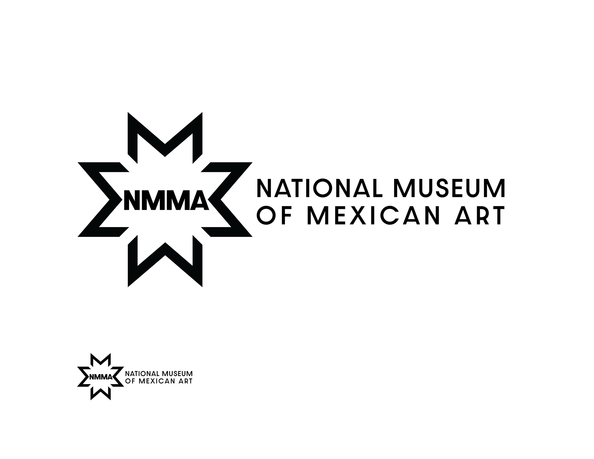
Design Thoughts
This design used the letter M repeated to make a unique shape, similar to the Dahlia concept but more rigid. The space between the letters allows for the M to be seen clearly in every direction.
The abbreviation of the museum are in the center to allow for brand mark to be used as a stand alone symbol or in conjunction with the full museum name.
Font Pairings
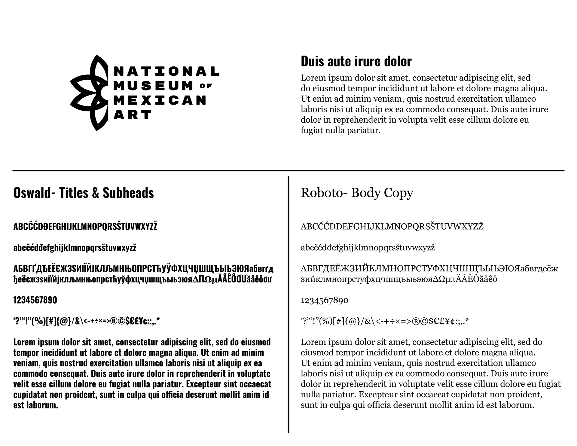
The typeface Oswald was chosen for titles and subheads because it is a clean, bold, sans-serif typeface. This provides a clean, modern look that is easy to read.
Roboto was chosen for body copy and is a complimentary serif typeface to Oswald. The use of Roboto for body copy creates a professional and authoritative feel without being overbearing.
Vibrant Color Palette
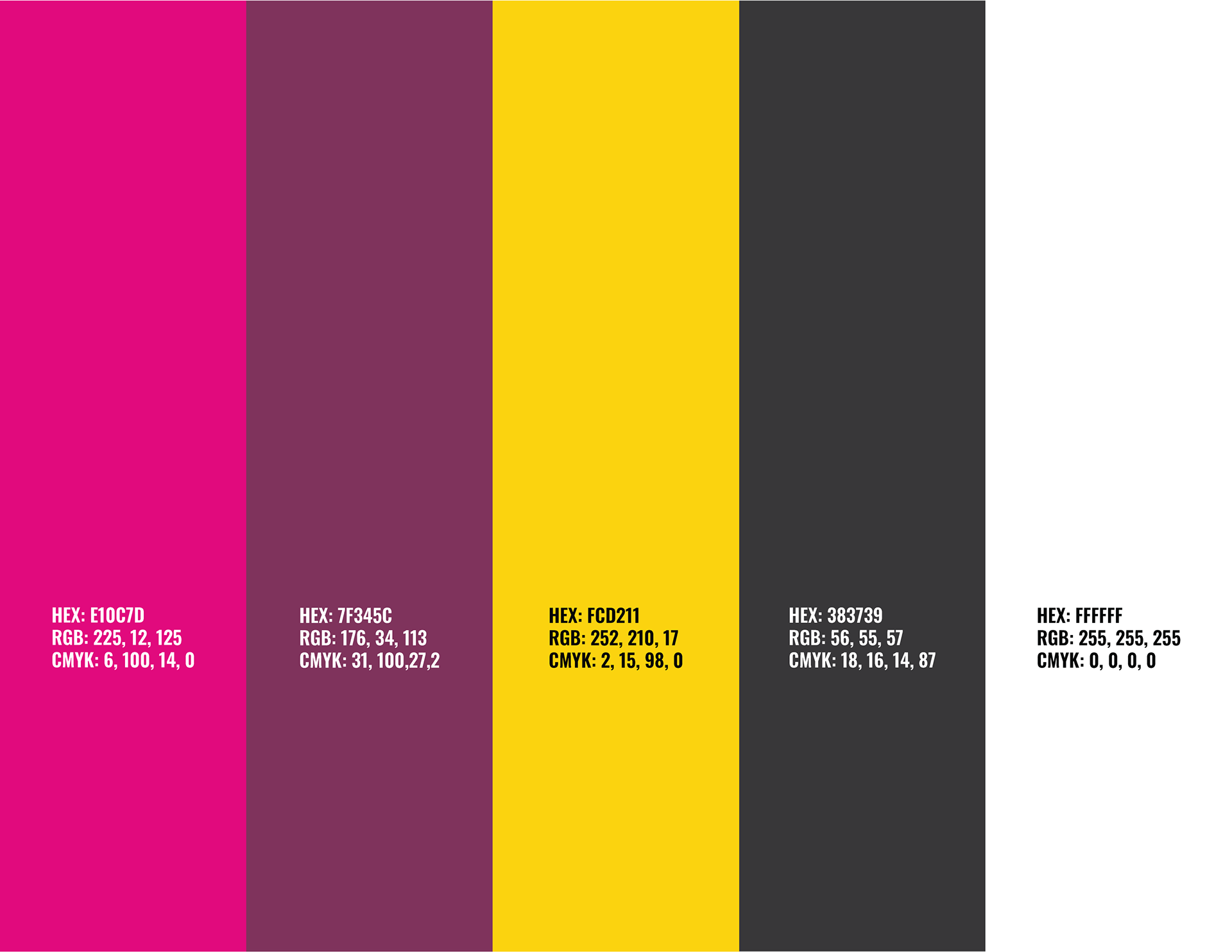
The Dahlia comes in multiple colors: white, yellow, oranges, pink, red, burgundy, etc.. I chose a strong, vibrant pink as the primary logo color with a dark purple and a golden yellow as accent colors. This combination of colors creates a lot of energy but feels inviting.
Brand Stationary
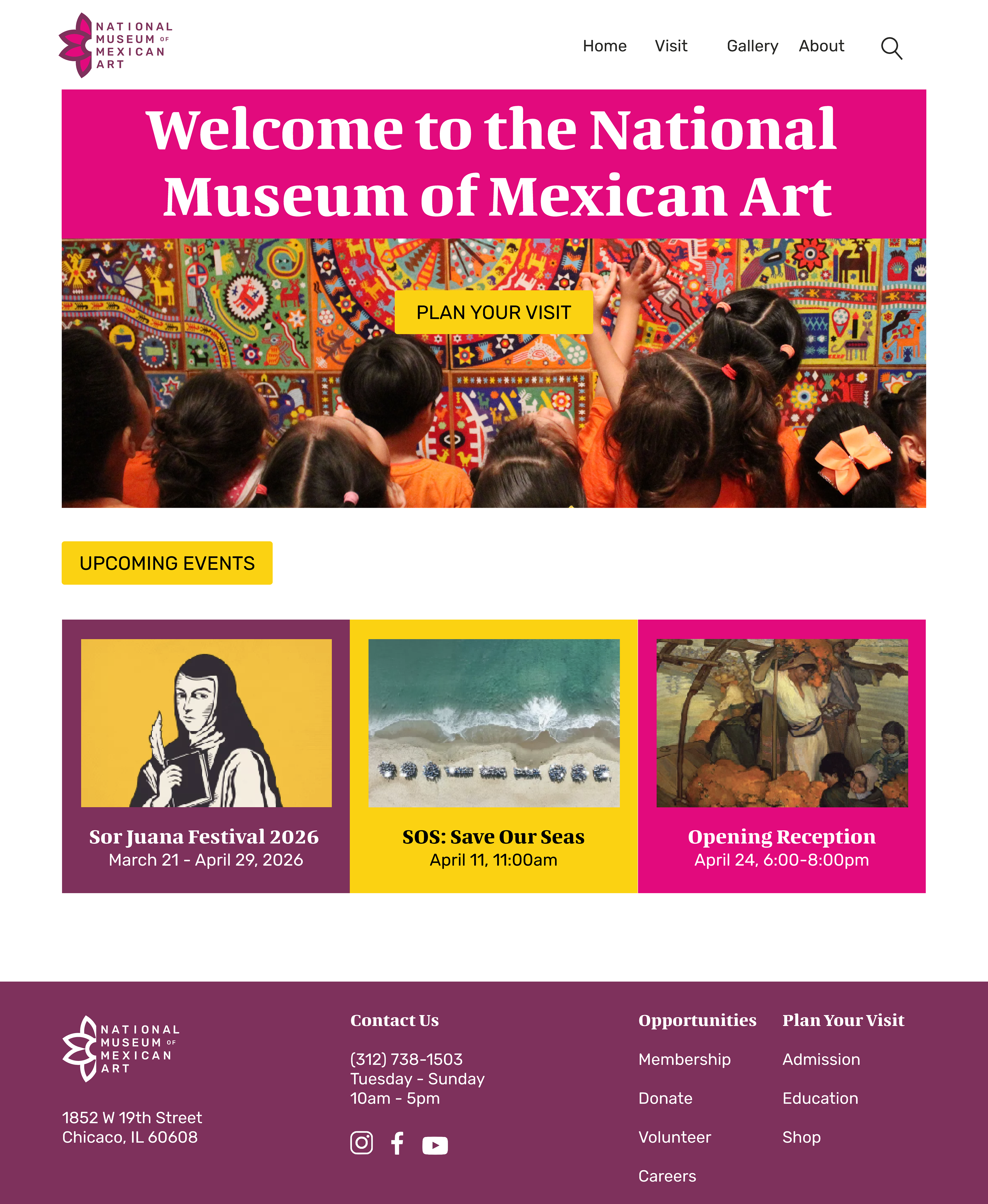
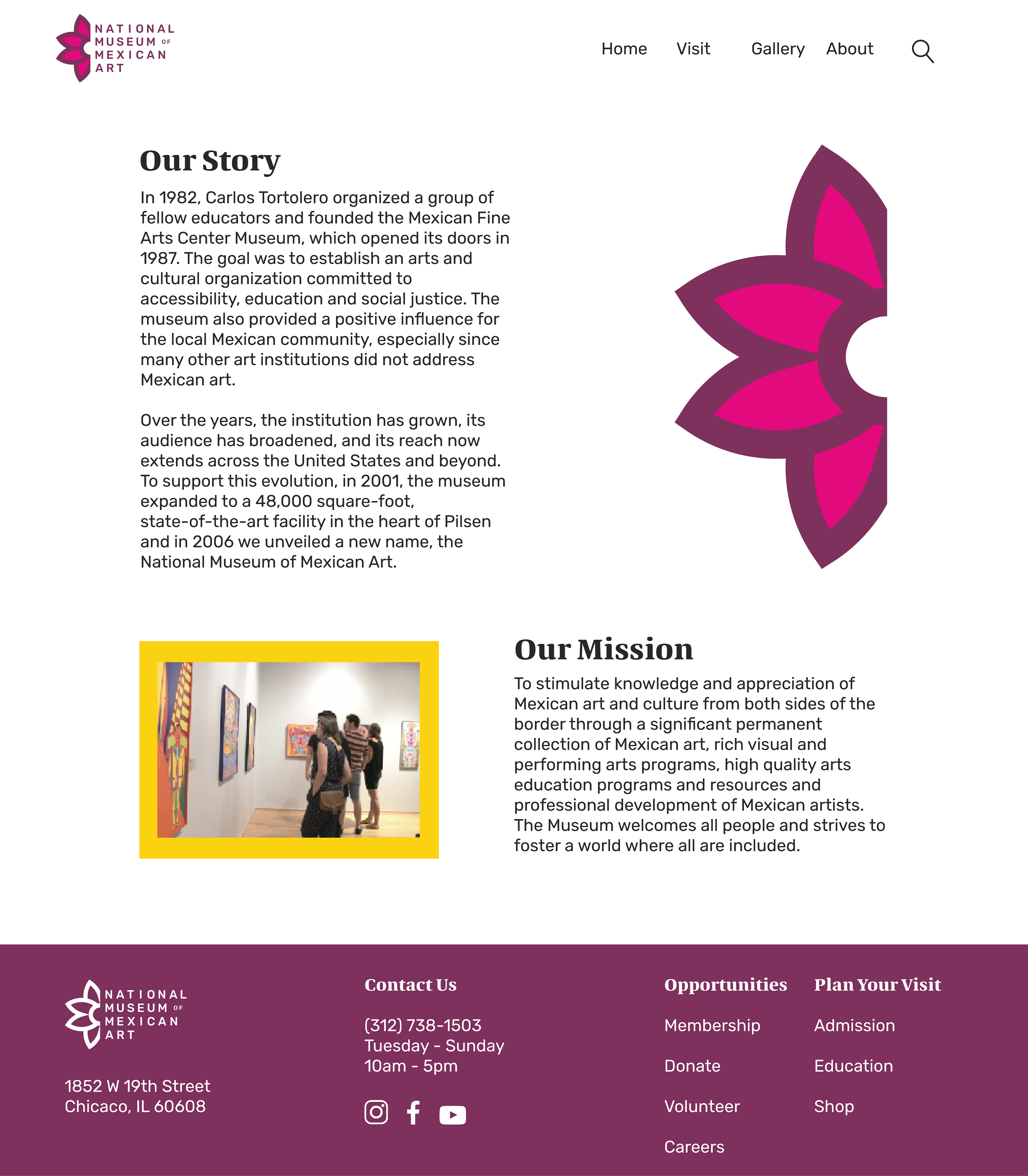
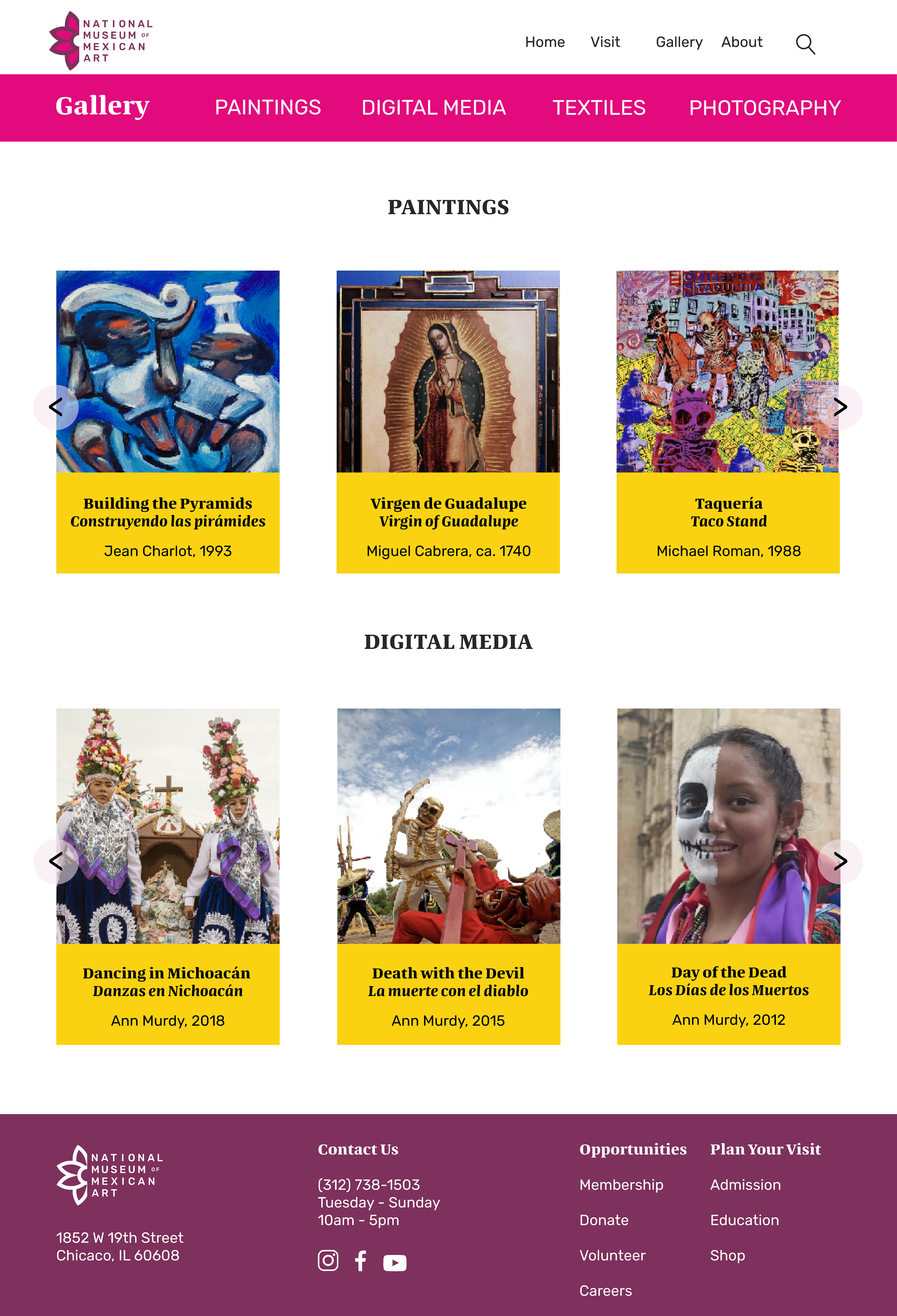
Website Redesign